

What’s the best fonts for resumes these days? When you are crafting a resume that needs to impress both human recruiters and automated systems, every detail matters. While you might be focused on perfecting your bullet points and quantifying your achievements, there’s one foundational element that often gets overlooked: typography. Choosing the best fonts for resume submissions can make the difference between a document that gets carefully reviewed and one that ends up in the digital trash bin.
The reality is that your resume’s visual presentation creates an immediate impression before anyone reads a single word. A professional, readable font signals attention to detail and respect for the reader’s time. Conversely, a poor font choice can undermine even the most impressive credentials. As we navigate the job market, understanding how fonts interact with both Applicant Tracking Systems and human psychology has become more crucial than ever.
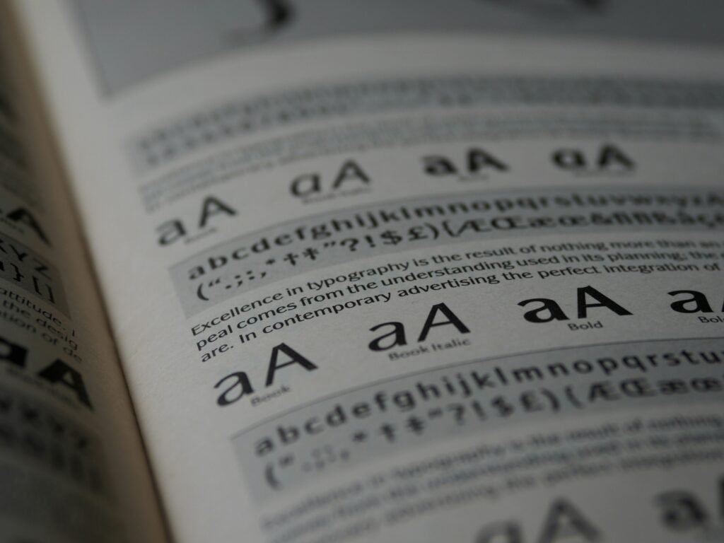
Why Typography Matters More Than You Think
Think about the last time you received a document in Comic Sans or Papyrus. You probably made an instant judgment about the sender’s professionalism, even before processing the content. Recruiters experience this same visceral reaction when scanning resumes. They are reviewing dozens, sometimes hundreds, of applications for a single position. A resume that’s difficult to read or looks unprofessional gets dismissed within seconds.
Beyond first impressions, fonts directly impact readability. Research in cognitive psychology shows that certain typefaces reduce eye strain and improve comprehension speed. When a recruiter can effortlessly scan your accomplishments, they’re more likely to remember you positively. This becomes even more critical, where hybrid screening processes mean your resume might be viewed on a desktop monitor, a tablet during a commute, or quickly pulled up on a smartphone between meetings.
The Gold Standard: Serif vs. Sans-Serif Debate
For decades, resume experts have debated whether serif fonts like Times New Roman or sans-serif fonts like Arial create better impressions. Serif fonts feature those small decorative strokes at the ends of letters, giving them a traditional, authoritative feel. They have long been associated with print media and academic writing, which is why they dominated resume advice for years and natually have been considered the best fonts for resumes.
Sans-serif fonts, meaning “without serifs,” offer clean lines and modern simplicity. They have surged in popularity as digital reading has become the norm. Both can work beautifully, but your choice should align with your industry and the specific role you are targeting.
For creative industries, technology startups, or design-forward companies, sans-serif fonts signal that you understand contemporary aesthetics. They project innovation and modernity. If you’re applying to law firms, financial institutions, or academic positions, serif fonts often feel more appropriate, conveying tradition and gravitas.
Best Fonts For Resumes: Top Professional Choices
Calibri has emerged as the modern professional’s default choice, and for good reason. It replaced Times New Roman as Microsoft’s default font back in 2007, and an entire generation of workers has grown comfortable with its clean, approachable aesthetic. Calibri reads beautifully on screens, maintains its clarity when printed, and gives your resume a contemporary feel without being trendy. It’s particularly effective for mid-career professionals in business services, healthcare administration, and technology sectors.
Garamond represents the elegant evolution of traditional serif fonts. Unlike the sometimes stuffy appearance of Times New Roman, Garamond offers sophistication with warmth. Its graceful proportions allow you to fit more content on a page without sacrificing readability, making it ideal for experienced professionals who need to present extensive accomplishments within a two-page limit. Publishing, education, nonprofit, and consulting professionals often find Garamond strikes the perfect balance.
Arial remains a powerhouse for one crucial reason: universal compatibility. Every system, every ATS, every screen can render Arial perfectly. While it might lack the personality of more distinctive fonts, its reliability makes it a safe choice when you are uncertain about the technical requirements of an application system. Arial works particularly well for technical roles, engineering positions, and any situation where substance matters more than style.
Georgia brings the readability of serif fonts into the digital age. Designed specifically for screen reading, Georgia maintains its clarity even at smaller sizes. The slightly larger x-height (the height of lowercase letters) means your content remains accessible even when a recruiter zooms out to view your full resume layout. It’s an excellent choice for communications professionals, writers, editors, and anyone in content-driven fields.
Helvetica has achieved near-mythical status in design circles for its perfect neutrality and timeless appeal. If you have access to Helvetica (it comes standard on Macs but requires purchase for Windows), it elevates your resume with understated sophistication. Marketing professionals, designers, architects, and anyone in visually-oriented fields benefit from Helvetica’s association with premium brands and thoughtful design.
Fonts to Avoid at All Costs
Some fonts carry so much negative baggage that using them actively hurts your candidacy. Times New Roman, despite its long history as the resume standard, now reads as outdated and lazy to many recruiters. It screams “I didn’t bother to change the default settings,” which isn’t the message you want to send.
Comic Sans has become a punchline in professional circles. Its casual, almost childlike appearance has no place in serious business communications. Even if you’re applying for creative roles that value personality, Comic Sans suggests you don’t understand professional norms.
Courier and other typewriter-style fonts make your resume look like it time-traveled from 1982. Unless you’re deliberately creating a retro design piece for a very specific creative role, these monospace fonts waste valuable space and reduce readability.
Decorative or script fonts might seem like a way to stand out, but they typically backfire. Brush Script, Curlz, Papyrus, and similar fonts are nearly impossible for ATS to parse correctly, and they’re exhausting for human readers to process quickly. Your resume needs to be scanned in seconds, not deciphered like an ornate wedding invitation.
The Technical Side: ATS Compatibility
Applicant Tracking Systems don’t “see” your resume the way humans do. They extract text from your document and feed it into a database. Fancy fonts, especially decorative ones, can confuse this parsing process, causing the system to misread or completely skip your carefully crafted content.
Sticking to standard fonts ensures that when the ATS scans your resume, it correctly captures your job titles, dates, company names, and keywords. This matters enormously because recruiters often use their ATS to search for specific terms. If your font choice caused the system to miss “project management” or “Python programming,” you won’t appear in their search results, regardless of your qualifications.
The safest approach is maintaining a separate master document in a highly compatible font like Arial or Calibri specifically for online submissions through application portals. You can keep a more stylistically ambitious version using Garamond or Helvetica for situations where you’re emailing directly to a hiring manager or bringing physical copies to an interview.
Size, Spacing, and Hierarchy
Selecting the right font is just the beginning. How you use it determines whether your resume succeeds. Your font size for body text should range between 10 and 12 points. Anything smaller strains the eyes, particularly for recruiters who are looking at screens all day. Anything larger looks juvenile and wastes precious space.
Your name deserves prominence, typically rendered at 18 to 24 points, depending on the length. Section headers should be 14 to 16 points, creating clear visual hierarchy without overwhelming the page. Consistent spacing between sections guides the reader’s eye naturally down the page, letting them absorb information in the order you intend.
Line spacing, often overlooked, dramatically affects readability. Use 1.15 to 1.5 line spacing for your body text. This gives your words room to breathe without creating awkward gaps. Margins should be at least half an inch on all sides, though you can tighten them slightly if you’re trying to fit extensive experience onto two pages.
Formatting for Multiple Submission Methods
These days you need to be prepared for various submission scenarios. When uploading to an ATS, save your resume as a Word document using standard fonts. The system can more reliably extract information from DOCX files than PDFs in many cases, though this varies by platform.
When emailing your resume directly to a hiring manager or recruiter, a PDF preserves your formatting perfectly across different devices and operating systems. This prevents the awkward situation where your carefully arranged resume turns into a formatting disaster because the recipient doesn’t have your chosen font installed.
For networking situations where you are handing someone a printed copy, you have more creative freedom. Higher-quality paper and a slightly more distinctive font choice can make a memorable impression. Just ensure that any printed version matches what you’ve submitted digitally to avoid confusion.
Industry-Specific Considerations
Different fields have different expectations around professional presentation. In conservative industries like finance, law, and insurance, traditional choices like Garamond or Georgia signal that you understand professional norms. These sectors value stability and proven track records over innovation in presentation.
Technology companies and startups generally prefer modern sans-serif fonts. Using Calibri, Helvetica, or even the slightly more contemporary Lato shows you’re current with design trends without being flashy. These organizations want to see that you think about user experience even in how you present yourself.
Creative fields offer the most flexibility, but even here, readability trumps artistic expression. A graphic designer might use a distinctive but still professional font like Proxima Nova or Avenir. A copywriter might lean into the authority of a refined serif like Freight Text. The key is demonstrating design sensibility while keeping content front and center.
Testing Your Font Choice
Before finalizing your resume, conduct a simple test. Email it to yourself and view it on different devices: your computer, your phone, a tablet if you have one. Does it remain readable? Do any elements shift or break? Ask a trusted friend or colleague to open it and provide honest feedback about their first impression.
Print a copy and look at it under different lighting conditions. Sometimes a font that looks perfect on a backlit screen appears thin or hard to read on paper. If you’re bringing physical copies to an interview, you want them to look just as professional as your digital version.
Run your resume through a free ATS simulator tool. Several online services let you upload your resume and see how well an ATS would parse it. If the system is misreading sections or dropping information, your font choice or formatting might need adjustment.
The Bottom Line on Resume Fonts
Your font selection represents a small but significant decision in your job search strategy. It won’t overcome weak content or lack of relevant experience, but it can ensure that your genuine qualifications get the attention they deserve. The best approach combines readability, professional appropriateness for your field, and technical compatibility with modern hiring systems.
Choose a clean, professional font that you find personally appealing within the acceptable range. You’ll be staring at this document quite a bit as you customize it for different applications, so pick something you don’t find boring or irritating. Maintain absolute consistency in your choice throughout the document. Mixing fonts rarely improves a resume and often makes it look chaotic.
Remember that your resume is a marketing document, not a design showcase. The font serves the content, never overshadowing it. When a recruiter finishes reading your resume, they should remember your accomplishments and qualifications, not thinking “interesting font choice.” That subtle, almost invisible quality of good typography is exactly what you’re aiming for.
In today’s competitive job market, every advantage matters. Taking the time to select and properly implement the right font demonstrates the kind of attention to detail that employers value. It shows you understand professional communication and respect the reader’s time. Most importantly, it ensures that the substance of your experience and achievements gets the clear, unobstructed presentation it deserves.